Friday, November 21, 2014

Fall Glitter Market @ Paper Crown!!!

Hi Everyone!
The Paper Crown in OKC is once again hosting their bi-annual Glitter Market!  The vendors that present at this Market are always over the top, oozing with talent.  I can't wait to see all the beautiful goodies everyone will have to get us all into the holiday spirit!  Cindy, the owner always has such gorgeous displays all over the store; you will definitely want to shop the store as well.  If you are not from Oklahoma City, it is a hidden treasure totally worth the drive to come see.  I hope to see many of you there!  Especially you locals, you have no excuse not to come out and explore and get some Christmas shopping done while you are at it!  :)

Friday, October 24, 2014

Wanderlust Art Contest @ UncommonGoods!

I am tickled pink to announce that I am a finalist in the UncommonGoods Wanderlust Art Contest.  I have always been a huge fan and frequent buyer at UncommonGoods.  They have the coolest, quirkiest, clever ideas for gifts, it is definitely my go to one-stop-shop online. 
 
Being huge supporters of the arts and recycling, UncommonGoods has a special place in my heart.  As many of you know, I love, love, love creating art and incorporating vintage and/or recycled goods into all of my work.  You can imagine my excitement when I found out that I had made it to the top 5 with my Wanderlust Window entry.  I am up against some amazing talent; as each piece is truly beautiful in it's own right.
 
This is such a huge opportunity, and I continue to welcome all the support you wonderful people have come to show me.  You all are my inspiration to keep creating and striving to do something new.  If you can spare just a few minutes, I would truly appreciate your vote.  As the fellow artists many of you are, you understand the grand exposure this could create for me.  As an incentive, I will be doing a CurlyQMosaics giveaway.  Please drop me a line letting me know that you voted, so I can make sure to include you in the giveaway.
 
Here are the details...
Go to the UncommonGoods Voter Tool and you will see my "Wanderlust" Window. To vote, be sure to register at Uncommon Goods for your vote to count.  Again, I thank you for your support and I will be back soon!
Amy

Monday, June 9, 2014

Life Is A Circus at JUNK HIPPY!

In just a few short days, JUNK HIPPY returns to OKC for another fabulous, fun-filled day with over 200 vendors peddling their vintage, repurposed & handmade goods.  The show is going to have a vintage carnival flair.  Emblazoned across the Junk Hippy shirts for sale are the words, "The Greatest Show on Earth!"  I couldn't agree more! 
 
Like what you see?  This "Life Is A Circus" window is one of several originals I will have for sale at Junk Hippy.  In addition to originals, I will have 8X10 prints, pillows & greeting cards.
 
If you live anywhere in the state of Oklahoma, this show is definitely worth the drive!  I hope to see many of you Saturday!  Be sure to leave a comment here, or on my Facebook page for your chance to win free admission for 2!
 
PS, "The Greatest Show on Earth" shirts are created by An Altered Ego.  Definitely on the top of my "have to have" purchases this Saturday!

Thursday, May 22, 2014

"Tough Titty Said the Kitty...

...but the milk's still good."  Thinking back to your childhood, did you ever hear your mom or grandmother say this phrase?  I sure did.  Usually expressed when one of us grandkids was throwing a temper tantrum or things just simply weren't going our way. 
 
Awhile back I saw this vintage style Cavallini cat paper and thought it would be lots of fun to work with.  Not so much the cat lover myself as I am allergic to the fur, I knew there are many cat people out there who would be all about this.  Wanting something simple yet bold, just the words "TOUGH titty" was perfect.  Initially I was hesitant to create this window, wondering if it might be offensive or distasteful to some.  Apparently I was wrong.  I made this window, and it was a hit.  I sold it right away, and had many prints of it that sold as well.  Since it was very well received and evoked memories of past for many, I know that this is a window I plan to create again.  In fact, I plan on making and having one of these for sale at the upcoming Junk Hippy Show OKC on June 14.  In addition to an original and 8X10 prints, I will have greeting cards of this design as well.
 
Let this window be a lesson for me.  As an artist, sometimes you have to take chances; for the chances are usually the most successful creations.
 
Speaking of cats, Paper Issues has a fun challenge going on right now, "It's Raining Cats & Dogs."  What a fun theme to play along with!  If you have any layouts, cards, etc that involve cats and dogs and include paper, why not share?!?
 
Have a great one!
Amy

Tuesday, May 13, 2014

wanderlust...

As stated in the dictionary, this fabulous word is defined as follows...
wan·der·lust  [ wóndər lùst ]   a strong desire to travel
 
With summer vacation just a mere few weeks away, there is no better time than to share this window of mine with all of you.  I created this window completely inspired by the original lithographed map in the background.  Found at an estate sale, I knew I had to have it.  The rich aqua in the print is stunning, along with all the signs of age in the water stains, tears, etc.  The best part:  they had 3 of these maps rolled up and tucked away in a corner.  Talk about a fabulous find for me!  Going through my rather large stash of vintage windows, I found one that fit it almost perfectly.  The overall dimensions of the window itself are appx 40" wide X 30" tall.  As you can see, this window is rather massive to say the least.  As for the word "wanderlust"  I chose it because of the magical feel to it.  It sounds so whimsical. 
 
Right now hand lettering and script fonts are all the rage.  I have always had pretty decent penmanship, so I decided to hand write it rather loosely.  Surprisingly enough, I liked the overall look and I created it within the framed space pretty effortlessly.  As for the mosaic tile on top, I painstakingly cut every single piece to create the overall design just so.  It took many hours, and there are close to 1,000 tiles on there!  Lastly, I applied and "carved" out the mocha colored grout in my signature style. 
 
Although this window has already sold, I am currently creating another one just in time for my next show in June, JUNK HIPPY ROADSHOW.
 
Since I am such a fan of recycling and upcyling with an artistic flair, I always enjoy visiting Lessology's Blog to see what current challenges they have going on.  Right now, the challenge is "Window Display," using at least one upcycled product in your design.  Could my Wanderlust Window fit the criteria any better?!?  If you like upcycling materials in your work as much as I, you should stop by their blog for more details, the deadline to submit is June 1, so come play along!
 
Talk to you soon!
Amy

Friday, April 25, 2014

HAPPY EARTH DAY!!!

In honor of Earth Day this past week, I would like to share with you a window I created featuring our "big blue marble in space," the Earth.  A few years back I came up with the idea of using the phrase, "Earth Angel" whenever including globes in my work.  The pediments I made here, and the Tim Holtz card I made here are just a few examples. 
 
This past fall, I had been anxious to use this very ornate plaster frame for one of my layered works.  Unfortunately, I dropped it and it broke into a million pieces.  Rather than scrapping it all, I was able to create the big wings on the window out of that frame.  :)  The vintage globe was cut in half.  To create some extra visual interest, I painted vertical stripes with Martha Stewart's Sea Glass paint.  Definitely one of my favorite colors.  The banner across the top is simply some kraft paper, and the edges are finished in Liquid Glass and Tim Holtz Rock Candy Glitter.  The letters on top are vintage plaster.  I am loving the background paper I chose for this piece.  It is from Martha Stewart.  The lantern pattern in the background mimics the stripes on the globe itself.  The aqua and green are the perfect representation of the earth's land and sea
.  The final addition to the piece was the vintage laurel leaves at the bottom.  Made of a heavy duty metal, I think it helped to ground the piece nicely.
 
As you can tell in the description, most of the materials I used were all about repurposing...the window, globe, the broken frame, letters and the leaves.  Giving something old a new life is something I truly enjoy doing.  Thank you so much for stopping by!
 
Amy

Tuesday, April 22, 2014

Custom Quatrefoil Window for Baby Emma

Hello friends!  Today I would like to share with you a custom window I created for a beautiful baby's nursery.  A wonderful customer and friend contacted me to create this special one-of-a-kind window to go over the baby's crib in the nursery.  The entire room is done in wonderful shades of gray, with lots of elegant patterns throughout.  From the chandelier and precious quilt, to the quatrefoil rug and painstakingly perfect patterned accent wall, this nursery is definitely fit for a princess!  
 
The window design itself is a new method I have been playing around with.  I created the overall quatrefoil pattern using the Sizzix Bigz Die - Label, Moorish.  I rounded up an extensive pile of gray patterned papers and was very pleased with the variety.  By spacing the diecuts, the negative space takes on the quatrefoil pattern that is so popular right now.  Leaving the open borders around the shapes, also creates a wonderful extra dimension you don't see in my other windows.  When hanging on the wall, it allows the color of the wall to shine through from behind.  Such a dramatic effect, I love the way it turned out. 
 
I congratulate Meghan on your new bundle of joy, Ms. Emma.  May this window bring a lifetime of enjoyment for your baby girl.  I sincerely thank you for allowing me to create something so very special, for such a wonderful time in your life.  :)

Monday, February 24, 2014

Oh, The Places You'll Go...

Since my last post, I have been a very busy girl.  Junk Hippy OKC was back in June, and the grand finale Girlie Show was in November.  It was fun to create for the final show.  I really pushed myself to come up with some over the top ideas.  Not only did I come up with lots of new creations, I also ventured into producing many of my works onto greeting cards, prints and throw pillows.  I am so glad I did.  These smaller items were a hit, and allowed me to spread my art out into the world a little further.  :)
 
Today I am sharing with you my most recent creation, "Oh, the places you'll go..."  My brother and sister-in-law are expecting their first baby in 1 month.  I am so excited, I can't wait to meet my little nephew and shower him with all kinds of love.  My sister, mom and I threw the baby shower this past weekend.  One of the gifts from me was this window for the nursery.  We planned the shower around this theme.  We had big globes on all the tables as centerpieces, we made hot air balloons out of paper lanterns and baskets, and everything was somehow touched with the beautifully dreamy sky/aqua blue. 
 
As for the window, the plan is for it to go right above the crib.  The nursery is very classy, done in dark brown, harvest gold, & baby blue.  The colors and patterns are so rich, the room is definitely fit for a king!  I hope that Baby Ryan will see this window and always think of his Auntie Amy.  Life is such a gift, and his life is just about to begin.  Oh, the places he will go...a true adventure we call life.
 
Thanks so much for stopping by!  I promise to post again soon and share some of the many new creations I have conjured up in my head!
Amy

Saturday, June 1, 2013

Damask Wall Hanging

Hi Friends-
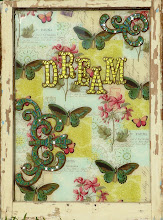
Tonight I would love to share with you my newest Sizzix project, a damask wall hanging.  I used lots of Sizzix dies and vintage ephemera to create.  With lots of layering and use of color, this makes for a very vibrant piece. 

To create, cut the embossed red paper to fit the oval frame.
Next die cut 9 baroque ornamental shapes out of handmade aqua paper.  Die cut 2 of the ornate frames out of aqua metal & the Italy map paper from Cavallini.  To create the embossed bracket, die cut the hanging sign out of copper sheeting.  Emboss the sign using the Subway embossing folder by Tim Holtz.  For the last die cut, create a 
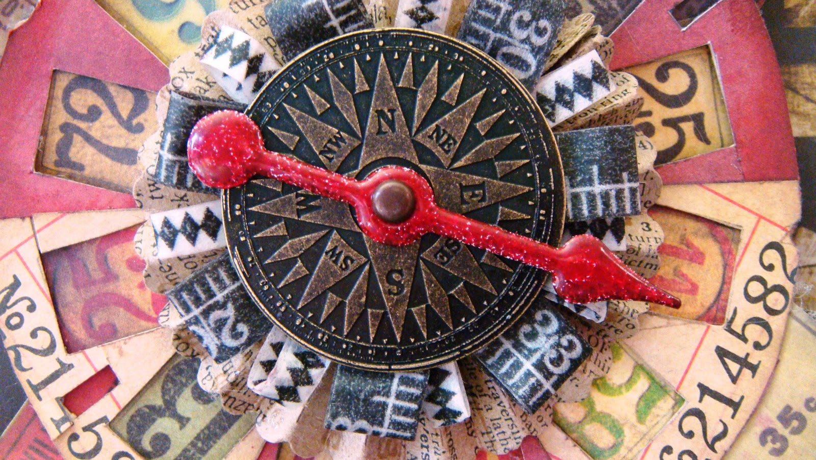
rosette out of black paper from Melody Ross' Artsy Urban Collection. 

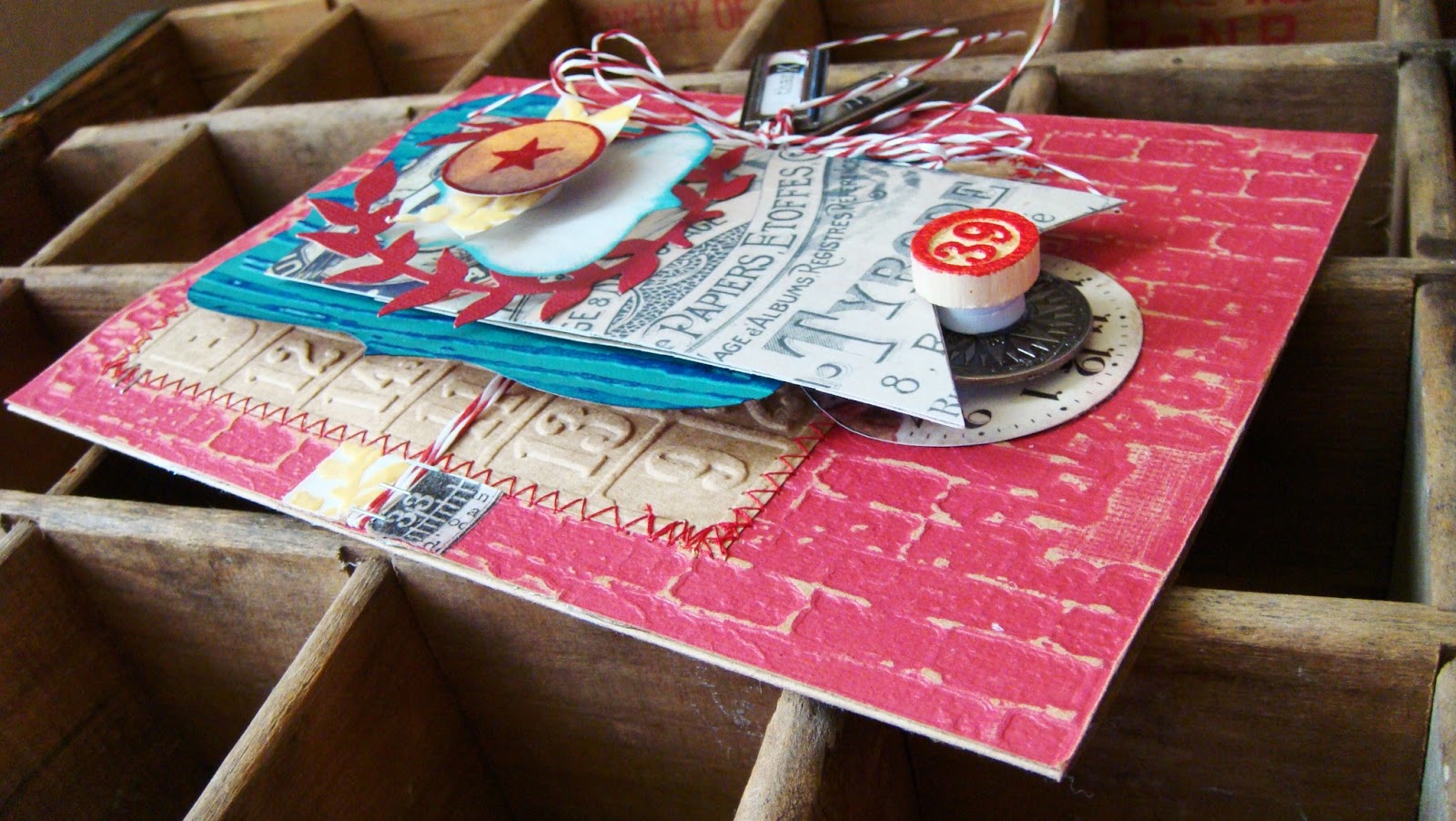
Once all the die cuts are made, round up all the vintage ephemera and ribbon.  Aside from the 18" tall frame, the vintage items I used are a bingo card, lots of cigar labels from Retro Art Cafe, a milk bottle cap and a black/white flower, with the perfect bling in the center.

Now is the fun part, assembly! I wanted the backgrount to look like vintage wallpaper.  To create great dimension, place foam dots behind the baroque ornament die cuts. Next, start layering everything in the center...starting with the bingo card, then the copper hanging sign, and then the ornate frames X 2.  To create the prize ribbon, after creating the rosette start folding cigar labels around the outer edge and adhere.
Fanning out 3 labels at the bottom, I added the red seam binding, aqua & black/white ribbons.  Once complete, adhere the prize ribbon to the very center of the frame.  Add the milk cap and the black/white flower for the finishing touch.
For me, the project was such a fun project to create and I am happy with the finished project.  I hope you like and I have inspired you to create!  :)

Supplies used:
Paper:  K&Co Holly Vine Red Blind Embossed Paper, Mark Richards Aqua Jadestone Paper, Cavallini Italy Map Paper & GCD Melody Ross Artsy Urban
Ribbon:  May Arts black/white, Webster's Pages aqua/white & red seam binding
Vintage:  Brass oval frame 18" tall, bingo card, lots of cigar labels from Retro Art Cafe, milk bottle cap & black/white flower
Other:  aqua metal, foam dots, copper

Sunday, May 12, 2013

Love Who You Are Card @ Sizzix!

Hi Friends!  Just wanted to let you know that I have a new post over on the Sizzix Blog!  I created this "Love Who You Are" Birthday Card for my niece's 15th birthday.  It was fun to create and the bird "flair" is a fun added touch for a teenager.  :)   Want to make this quick, simple card for someone special in your life?  Then head on over to Sizzix for all the details.  What are you waiting for! 

Happy Birthday Jordyn!

Tuesday, April 30, 2013

Keep Calm & Just Call Mom! :)

If an aqua rotary phone doesn't scream vintage, I don't know what does!  Awhile back I got my hands on the vintage telephone die.  I love die cutting shapes from unexpected materials.  I think that is why I love my Vagabond so much.  I am not the typical scrapbook and/or layout artist.  In fact I think I have only completed 5 layouts ever!  Being much more of a mixed media artist, I find myself always looking to incorporate other things than the traditional paper.  Looking around for the next "die cut" victim, my eyes fell upon a gorgeous aqua blue shoebox.  This vintage shoebox housed some crazy cool women's bowling shoes from the 1940's.  The box was really thick chipboard, and using the bigz die allowed the design to cut through it like butter!  :)  Then, I set it aside and admired my little aqua rotary phone until inspiration for that special piece would strike. 

I loved the aqua phone so much, I didn't want to use it on just a card.  I decided I wanted to create it into art...a home decor piece that could be admired again and again.  Being such an anxious person, I have really enjoyed the "KEEP CALM" poster craze you see everywhere.  You know, the "KEEP CALM & CARRY ON" to the "KEEP CALM & EAT A CUPCAKE!"  When I came across the "KEEP CALM & JUST CALL MOM," I knew this was the perfect caption for my sweet little phone.  The rest is history.

Now onto the details to create...
1.  Take a wooden window box frame and sand/distress all the wood's edges and corners.  I used an UMBRA frame.  It has 4 layers of glass and the display area is 5.5 X 7".
2.  Discover some fabulous ephemera for the background layer.  I found a 1959 Jonesboro, Arkansas phone directory at an estate sale.  It is loaded with cool vintage advertising and all the phone numbers are only 5 digits long.  The directory has white pages, yellow pages and another section that is a minty green/pale aqua color.  For me, it's all about the details.  If you notice, the page I chose to use has a greenhouse advertisement.  At the left is an illustration of mums.  Flowers and gardening always makes me think of Mom.  How about you?

3.  In addition to the telephone , die cut 3 sets of the vintage alphabet into black contact paper/vinyl.
Cut one more telephone out of the black vinyl too.  The center will be used later.
4.  Dip all the die cut letters in dark gray paint halfway down and set aside to dry.
5. Now it's time to assemble! As I said earlier, there are 4 glass panes that slide in and out of the frame. Starting with the first layer aka the back, place your 5.5 X 7" piece of ephemera on the glass. In this case, the mint/aqua directory page. Layer 2 will be the letters. Once the letters are dry, they are easy to peel and adhere.  Remember, they are created from contact paper!  :)  Measure the pane evenly and be sure to allow space for the telephone in the center.  The black letters dipped in the gray paint is a very cool added detail.  It almost looks ombre' and adds visual interest.  The 3rd layer is for the phone. Center it and adhere it to the glass.
The 4th layer is the very top layer.  Place the black center of the phone directly over the aqua one below. Create a 1" button out of map paper to tie in the colors. I added the American Crafts ampersand sticker.  The font goes perfectly with the vintage alphabet.  Don't you think?  Apply "just" script stickers over the base of the phone.  I love the contrast.  The last step is to cut a pointed finger out of Tim Holtz' washi tape and place directly left of "CALL."

As I said earlier, I am an anxious person and always have been.  May this picture be a gentle reminder for when things get rough.  Who am I kidding?  My mom is always my first call!  :)  Thanks Mom for always being there.  I love you!

Sizzix Dies:  Bigz Vintage Telephone, Sizzlits Vintage Market Strip
Paper:  Danny O
Stickers:  American Crafts Remarks Transparent & Sarah Script White Letters
Washi:  Tim Holtz
Other:  UMBRA Window Box Frame, Black Contact Paper (adhesive backed)
Vintage Other:  1959 Telephone Directory of Jonesboro, Arkansas, Aqua Shoebox for phone
Tools:  Vagabond, sandpaper, 1" button maker, foam dots
Paint:  Gray


Sunday, April 21, 2013

World's Greatest Mom & Sizzix Debut!

Today is my official debut on the Sizzix Design Team!  Mother's Day is quickly approaching and what better way to celebrate the special ladies near and dear to our hearts...with something handmade.  To see all the details on how I constructed this trophy rosette/ribbon combo, please visit my post over on the Sizzix Blog.  There you will find many detailed photos and how to create one of your very own!

Thanks so much
for stopping by, have a wonderful Sunday!  :)
Amy

Wednesday, April 3, 2013

I am excited to announce...

I am on the SIZZIX Design Team!  This is my first official design team gig for a big manufacturer, and I must say I am very excited and a little terrified!  :)  This is all new to me, but I know it will be a great experience and such a wonderful opportunity.  Each month I will be creating and sharing projects and how-to's using some of my favorite Sizzix products.  From tons of dies and embossing folders, I hope to create some magic and inspire you along the way.  Adding my own personal twist, you can bet there will be lots of vintage ephemera and tons of layering!  Wish me luck on my newest adventure! 

Thanks so much for your continued support!
Amy

Saturday, March 30, 2013

Happy Easter!

I would like to wish each and every one of you a very blessed Easter tomorrow. May you celebrate the reason for the season with family, friends, and create many wonderful happy memories. :)

This pic is of 2 vintage lovelies my mother & I revived for Artifactory. Don't you just love that sweet sheep & bunny? I adore the way my mom added the perfect touch of millinery and velvet ribbon!

Thanks for stopping by! Check back tomorrow as I have some major exciting news to share!
Amy

Sunday, March 24, 2013

Artifactory!

Hello my beautiful friends!  Just wanted to share a new venture I have been working on behind the scenes, Artifactory!  What is "artifactory" you ask?  I must say it is a very cool word my brother came up with...it encompasses everything I love...repurposing & redesigning old & vintage "artifacts" through clever transformation into works of art.  :)
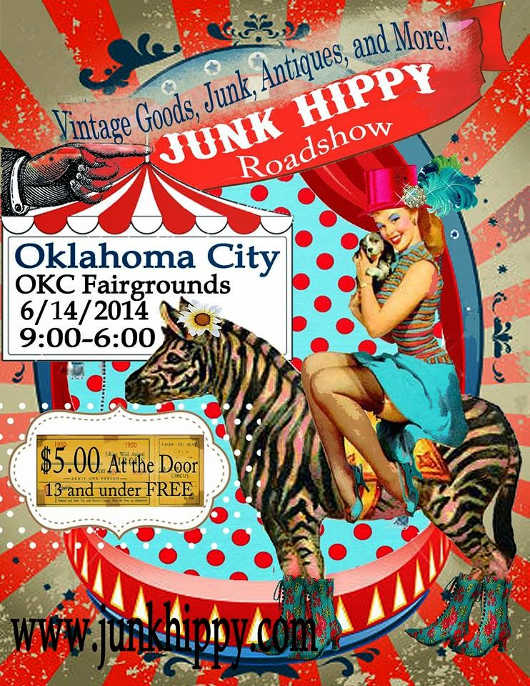
My mother, is where my creative genetics come from.  She is extremely talented, and she has maddening skills with the sewing machine & painting/distressing furniture.  Her decor and holiday displays in her home are like no other.  Where my talent is lacking, she makes up for it.  We are a good team that definitely compliment each other's design styles.  From furniture & lamps, to home decor and unique vintage finds...we have something to offer many tastes.  Our dream is to someday open a storefront where we can sell our wares as well as teach our ideas and share our talents with the community.  Until then, we will be selling our vintage goods and creations up at the Rink Gallery in Bethany, OK.  We also plan on doing the Junk Hippy Show OKC in June.  This is definitely a bonding experience for my mother and I!  Not that we aren't already super close anyways.  :)

If you are up in the Oklahoma City area, you should stop by the Rink and check it out.  You will be glad you did!  Fellow Normanites, never fear as I hope to continue selling my antique windows at Tulips on Campus Corner!  Be on the lookout for Artifactory in the future!

Verdigris, a fabulous vintage store in OKC shared a wonderful quote the other day on Facebook.  I leave this for you to ponder..."We travel.  We collect.  We arrange.  We rearrange.  We mix the old with the new; the bought with the found; the passed-down with the picked-up-along-the way.  We create these beautiful little galleries throughout our homes that express our passions and curiosities to all who pass through.  And then, we start all over again."  Author Unknown

Monday, February 25, 2013

"Spring Into the Studio"

It's "Spring Into the Studio" over at Paper Issues!  The team has a fun blog hop going on just to get us excited for Spring.  There are some fabulous Spring project ideas they are sharing with you to get your creative juices flowing.  The project I would like to contribute is this "peace" window I created.  Bursting with loads of vivid color, this is definitely one of my faves.  I have noticed one of the hot color schemes for Spring is the melon & robin egg blue.  The fabulous paper in the background is a Paper Source exclusive, Marigold.  I love the navy vintage plate I used for the tile.  It pops off the marigold pattern beautifully.  I usually always try to get matchy matchy with my tile and papers, but this time I took a chance and tried something different.  I must say I was delighted with the outcome.

I hope that my window has inspired you, put a little spring in your step, or even just a put a little smile on your face.  :) Be sure and peruse the Paper Issues Blog Hop, not only will you get tons of inspiration, there is a fantastic prize up for grabs.  Studio Calico is the sponsor, need I say more? 

Thanks for stopping by!
Amy

Thursday, February 21, 2013

Game Spinner Prize Ribbon

I love making prize ribbons and for this project, I wanted to showcase as many different Tim Holtz products as possible.  It is much larger than one might expect from looking at the pictures.  it measures approximately 14" so it definitely can make a statement all on it's own.  I love the way it was displayed at CHA.  They placed it on the waist of a big wire mannequin!  In fact, in Tim's CHA recap he shared pics of it on his blog.  As you can imagine, that was very exciting for me!  :)

Starting out with the rosette part of the prize ribbon, I wanted to create somewhat of a vintage game spinner.  Using the new picture wheel was the perfect start.  Tim uses a plethora of numbers in his product, and it follows through on his papers.  One of my favorite designs is definitely the one that is a huge collage of vintage game pieces.  Taking the picture wheel I created, I cut and placed the numbers in all the windows.  To add some height, I created a mini rosette using the decorative strip/mini paper rosettes die.  I then added all the fringe and fluff by creating loops out of the new paper tape, the paper stash 12X12 & the fabulous tissue paper.  I used a game spinner covered in 5 layers of embossing powder to give it that thick, red look.
For the dangling ribbons, I wanted a fun mix of texture, color and varying widths.  I love, love, love the cloth measuring tape.  It is so authentic, it felt sinful to even cut into it.  Adding the thick paper strips at the back and the journaling tickets to the front, I was almost done.  Taking the white seem binding and dying it in varying shades of red ink added the perfect distressed color I was looking for. 

I am pleased to say this entire creation was made using all Tim Holtz product...DIES:  NEW BIGZ Picture Wheel & Sizzlits Paper Rosette; PAPER:  Paper Stash Lost & Found 12X12, Paper Stash Kraft Resist, Paper Stash Collage 8X8; Tissue Wrap-Melange, Journaling Tickets, Game Spinner, NEW Compass Coin, Ruler Ribbon, Lavish Trimmings, NEW Elements Tissue Tape, Ranger Red Embossing Powder & Fired Brick Distress Ink.

This is the final project I created for Tim Holtz at CHA.  I wish that I had had more time to create many more projects.  This was my very first experience designing for CHA, and I must say that Paula and Tim made it very educational and exciting through the entire process.  This is a memory I will never forget.  Thanks again Paula and Tim for trusting in me and giving me such a great opportunity!

Until next time,
Amy

Friday, February 1, 2013

Earth Angel Card/Tim Holtz CHA Project #3

Since I am still loving the hot trend right now with globes & maps, I decided to create a card for a friend using the globe motif.  Back in December, I created a dimensional wall piece out of a vintage pediment you can see here.  It was the catalyst that inspired this card. Tim Holtz' style portrays worldly, ecclectic & nostalgic in such a wonderful way...I knew I could create something fun.  Coupling lots of Tim's product both old and new, I created this sweet card.  I think the colors are so fresh with the aqua and kraft, coupled with the sentiment, I am sure it would brighten a dear friend's day.  Don't you? 

Here are my favorite details of the card...1.  the blended ink around the edges evokes a light and airy feeling, sort of like the sky (I LOVE how the resist on the paper accentuates the intricacy of the design.)  2.  That little airplane up in the corner, it is so cute and is part of the NEW Element Remnant Rub-ons.  3.  Last but certainly not least is the ROCK CANDY GLITTER!  I love the glistening it adds to the wings...I had never even heard of it until Tim mentioned it.  Let me just say, I am in love!!!  :)

With the exception of the copper sheeting, all the products used are Tim Holtz...BIGZ DIES:  Vintage Globe, Heart Wings & Regal Crest;  Chit-Chat Stickers, Kraft-Core Core'dinations Nostalgic, Paper Stash Kraft Resist 12X12, Alpha Tiles, Rock Candy Glitter, Paper Stash Collage 8X8, Tiny Attacher/Staples, Paper Twine & the NEW Element Remnant Rub-ons. 
Thanks so much for stopping by, have a great evening!
Amy

Tuesday, January 22, 2013

Let Your Heart Take Flight...

Last summer I created a window box titled "Follow Your Heart" for my niece.  For my 2nd Tim Holtz CHA project, I decided to create a different version of the "Follow Your Heart" only this time using all Tim Holtz product.  You can check out the original version here.  It is amazing how different the second version looks! 

Since the entire creation was to be housed in a window box, there is tons of layering.  I challenged myself to see how many die-cuts I could incorporate into the overall design.  By the time I had it all laid out, I had used 5 different dies!  Nearing completion, I felt there was something missing.  Asking for a different set of eyes to brainstorm finishing touches, my mom suggested creating clouds in the background.  To her, the design had a steampunk feel...the star in the center reminded her of propellers on an airplane.  What a great idea mom!  Now, my challenge was to create clouds using Tim's product.  Playing around with my tools & scraps, I decided to create the clouds using the Layered Angel Wings Die!  I love finding different uses rather than the obvious sometimes, don't you?  By doing so, it can definitely turn into something magical!  :)

Just like the last TH project, I used tons of different product.  With the exception of some vintage flocked wallpaper for the wings, the cast iron star and the window box, everything is Tim Holtz.  In case you see anything you like, here is a complete listing of everything I used...Bigz Dies:  Layered Angel Wings, Regal Crest; Movers & Shapers Dies:  Mini Hearts Set, NEW Oval, & NEW Postage Stamp; Kraft Core'dinations Nostalgic Cardstock, NEW Paper Stash Collage 8X8, Paper Stash Kraft Resist 12X12, NEW Elements Tissue Tape (the pointed fingers around the inside of frame),  NEW Elements Remnant Rub-Ons, NEW Label Letters, Chit Chat Stickers, Journaling Tickets, Lavish Trimmings, Game Pieces & Ranger's Rich Red Embossing Powder.

Since Valentine's is just around the corner, I think this piece is perfect for this time of year.  Checking out some different challenges around the web, I found a Valentine's Day/Love & Ribbon Challenge over at Really Reasonable Ribbon's Blog.  I decided to enter my "Let Your Heart Take Flight" into the challenge.  Why not?  :)

Have a great evening!
Amy

Sunday, January 13, 2013

Tim Holtz Card & Favorites @ Paper Issues!

As promised, I will start sharing the projects I created for Tim Holtz CHA 2013.  This thank you card is the first project I created.  As a designer, I was primarily chosen for my intense layering style and my use of Tim's Sizzix dies.  To start creating, I chose to incorporate all of my "favorite" things.  What are some of my favorite things you ask?  I knew I wanted to use the Regal Crest Die; as I consider that particular die a staple tool for me.  It is so versatile, as you can see from the many past projects I have used it in.  I also wanted to do lots of the layering, and lastly I wanted to create with my favorite color combination:  red & aqua.

As for details on the card itself, there are tons.  Every single element on the card is from Tim Holtz with the exception of the yellow, vintage flocked wallpaper.  The beauty of creating Tim Holtz samples is that you get to incorporate both old and new product.  I used 3 different texture fades, 3 bigz dies, core'dinations kraft, paper stash, a game piece, paper twine & some of the newer findings like the metal tags & coins.

When I create, it is a lengthy process.  I can't just start attaching, painting & cutting. Unfortunately for me, I tend to over scrutinize every. single. detail.  I seriously move things around over and over again.  When I think I finally have it just so, I take a picture and then begin the process of assembly.  The machine sewing, the distressing, the stapling and adding all the dimension are the finishing step for me.  Insane isn't it?  I really admire those of you out there that just dive into your projects with wild abandonment and wind up with a masterpiece.  I really do wish my brain worked that way, it would truly save me lots of time and less stress!  :)

Since there's lots of materials used on the card, here is a comprehensive list of all the Tim Holtz product...Embossing Folders:  Bingo, Bricked & Woodgrain; Bigz Dies:  Regal Crest & Ornamental Movers & Shapers; Kraft Core'dinations Nostalgic Cardstock, NEW Paper Stash Collage 8X8, Lost & Found 12X12, NEW Label Letters, Chit Chat Stickers, NEW Tissue Tape Elements (ruler), Game Pieces, Paper Twine, NEW Compass Coins & NEW Tag Labels.

Because this is the first project I created for Tim Holtz & it exemplifies lots of my favorite things, I thought this would be the perfect "favorite" project for me to share for our newest theme at Paper Issues!  There is a huge blog hop going on, so you want to miss out.  Be sure to share your favorite project from 2012, we would love to see!

I can't wait to share more of my "Tim" projects! 
Stay tuned!  Amy